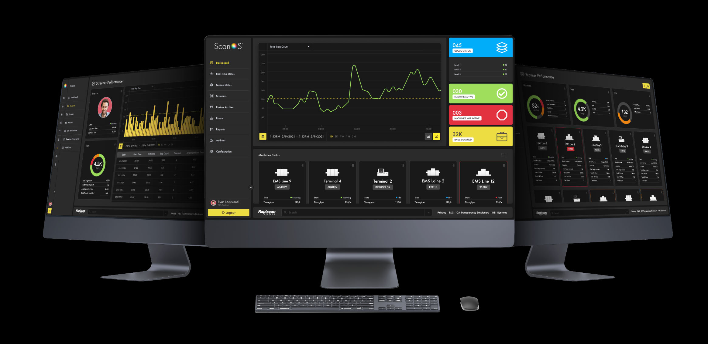
Rapiscan ScanOS

Rapiscan Systems is an American privately held company that specialises in walk-through metal detectors and X-ray machines for screening airport luggage and cargo.

Rapiscan Systems required a UI design for their reporting tool, ScanOS, that would help them monitor several devices at a single location.

For security reasons, this Figma prototype is kept private. Please request access by emailing me on joseph@2fernandez.com.

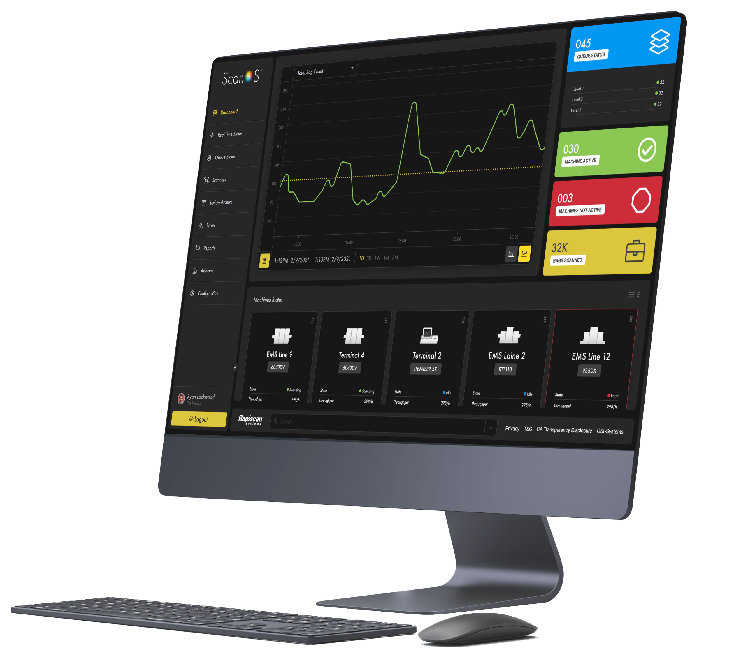
View Figma prototype

The Challenge

“Unify the functionality of 4 different applications currently being used by existing users into a single management and reporting solution”

My Role

UX Designer in a Team of 3

Deliverables

UI Figma prototype for Desktop App

UI Figma prototype for Mobile App

Branding Design style guide

Timeframe

7 Months into design and UI development

Status

In Development

Skills

Figma
Prototyping

FigJam
User flow map

Jira

Project management

Confluence
Documentation

Illustrator
Product design

Photoshop
Product design

Affinity
Style guide document

The Process

Project Estimation

Our initial engagement with the client began with a comprehensive meeting to gain a deep understanding of their vision, goals, and pain points.

This collaborative session allowed us to establish a strong rapport and ensured that we were aligned with their expectations.

Our approach enabled us to identify key challenges and opportunities within the project scope.With these insights, we crafted a detailed proposal outlining our proposed UX design strategy, timeline, and estimated resources required.

Foundational Research and Analysis

Once the main pain points was identified, our team promptly initiated a comprehensive foundational research phase to better understand how the existing solutions were being delivered and user analytics based on current user patterns.

We held detailed brainstorming sessions throughout the entire length of the project to better ideate and understand critical problems that could be fixed in the user experience.

We had little opportunity to gather primary data but used some secondary data to formulate primary market analysis.

Wireframing

We meticulously translated our research findings into a visual blueprint that serves as the skeletal framework for the user interface. We decided to build the wireframe in Figma and translate it into an active prototype as we moved through the project.

We find this approach extremely time saving while meeting client expectations.

The wireframe not only acts as a visual guide for the interface but also serves as a communication tool, facilitating a shared understanding among team members and stakeholders.

Prototype development

In the next phase of our UX design process, we seamlessly transitioned from wireframes to the development of a Figma prototype.

Leveraging the versatility of the Figma platform, our team translated static wireframes into an interactive and dynamic representation of the user interface.

This allowed us to simulate user interactions, refine user flows, and test the functionality of key features.

Want to see this prototype in action?
Call me on 0431 50 1188 and book in a demo.

Design sprints

We ran design sprints using Scrum methodologies which significantly enhance the success of this projects.

We conducted short, intensive cycles, allow for rapid ideation, prototyping, and testing throughout this project.

Design Handoff

Through Figma’s robust features, such as design components, styles, and detailed annotations, we were able to convey design intent, interactions, and assets effectively.

We maintained a constant cycle of providing UI coders with the appropriate assets and tools for them to programmatically bring the design prototype to life.